top of page

Cape Cod Cafe
DELIVERABLES
Rebranding
Strategy
Packaging Design
Website Art Direction
Sign Design
Menu Design
PROJECT DESCRIPTION
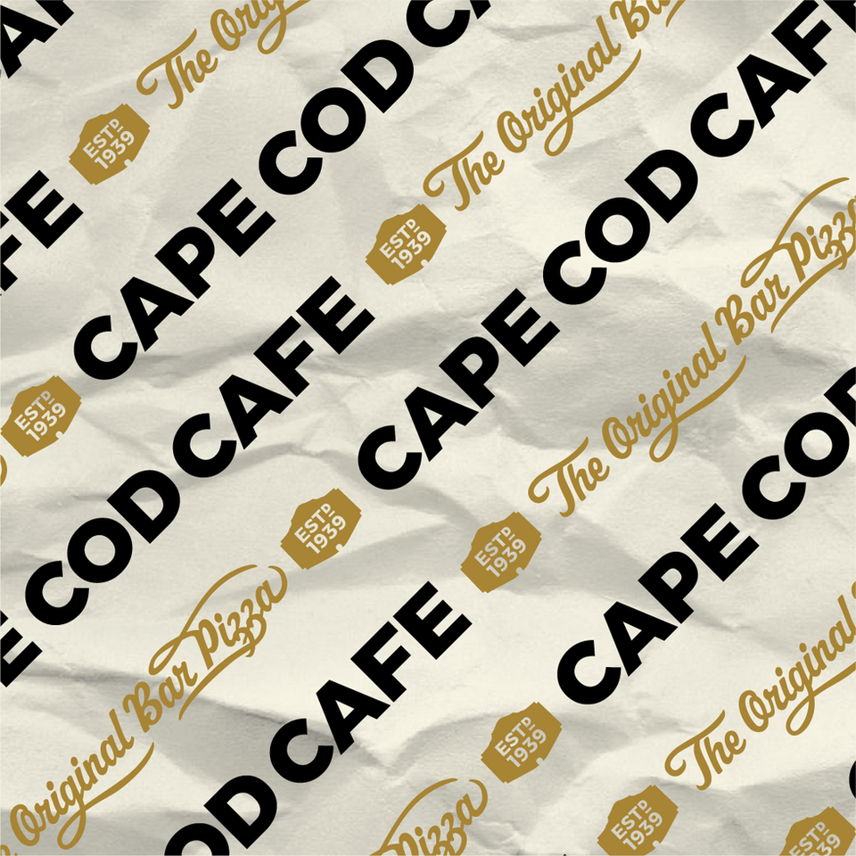
Rebranding doesn’t mean turning the page and running in the opposite direction. Cape Cod Cafe has such a huge and devoted following that we knew it meant we had to refine what was there and turn up the volume to 10. Fonts are bolder, wider and more geometric. The road sign shape is a smaller element so the type can take over. The scale is oversized, angled and with lots of overprinting. And most importantly we took a stand with the messaging: The Original Bar Pizza.
bottom of page


